
Combining Web Design with Original Art
Watercolour painting tutorial - Perspective
You will need a working knowledge of perspective otherwise your watercolour painting will look wrong. Before you put paint to paper you will need to sketch your scene with a soft pencil. If you use a pencil that is harder than 2B, it will be difficult to erase the lines later without damaging the watercolour paper. I shall not cover linear perspective here, that is how to draw buildings etc, but will say that it is important for you to choose where the horizon, or eye level, will be on your painting. This will affect how your buildings are to be drawn because the vanishing points will be on this line. Having searched the Internet, the best guides to drawing perspective can be found here and here.
 Linear perspective
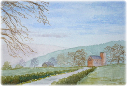
is demonstrated in this painting of Lanercost Road. Notice how the road becomes narrower with distance, and also leads the eye to Lanercost Priory which is the
focal point of painting. Notice too that different 'vanishing points' have been used for the Priory and the barn to left of the road. Linear perspective
is also demonstrated with the trees; the trees adjacent to the priory are larger than those in the distance. In real life the trees are
about the same size as each other. By using a vanishing point to the left of the painting a perception of distance is created. It is
well worth practising linear perpective with objects that are at, below and above eye level. Practise makes perfect!
Linear perspective
is demonstrated in this painting of Lanercost Road. Notice how the road becomes narrower with distance, and also leads the eye to Lanercost Priory which is the
focal point of painting. Notice too that different 'vanishing points' have been used for the Priory and the barn to left of the road. Linear perspective
is also demonstrated with the trees; the trees adjacent to the priory are larger than those in the distance. In real life the trees are
about the same size as each other. By using a vanishing point to the left of the painting a perception of distance is created. It is
well worth practising linear perpective with objects that are at, below and above eye level. Practise makes perfect!
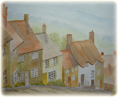
If only all linear perspectives could be as simple as Lanercost Road! Consider the painting of Shaftesbury on the left, which is probably one of the most challenging linear perspectives you could draw. First because the buildings are below eye level and also because they are on a hill that slopes down and to the right. This means that each building has a different vanishing point.
Before you start to colour in your sketch it is important to consider aerial perspective. The air contains moisture and affects how far you can see, what colours you see and also whether objects have hard or soft edges. These details are important to the watercolour artist so that the correct mood of the scene can be portayed in the painting. For example, the painting above gives the impression of a crisp autumnal day whereas a hazy summer's day is on the left.
 In landscape painting artists generally paint the sky first. You will note that the colour of the sky seems to be deeper close to you and lighter as it
recedes towards the horizon. You can create this impression be using a graded wash. In the painting to the right, I used a graded wash of French Ultramarine
adding a touch of light red close to the horizon.
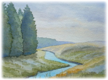
In addition to linear perspective, colours and tones are also used to give a feeling of depth. Cooler colours such as blues, purples and greys are used
for distant objects whereas warmer colours are used for the foreground. For example, in the painting to the right, the distant forest was painted with a weak
blue-green wash whereas the near trees have a greener, stronger tone. The distant moorland on the far right was painted with a mix of Ultramarine and
light red, and coming toward the stream this colour was used in a variegated wash with weak yellow ochre.
In landscape painting artists generally paint the sky first. You will note that the colour of the sky seems to be deeper close to you and lighter as it
recedes towards the horizon. You can create this impression be using a graded wash. In the painting to the right, I used a graded wash of French Ultramarine
adding a touch of light red close to the horizon.
In addition to linear perspective, colours and tones are also used to give a feeling of depth. Cooler colours such as blues, purples and greys are used
for distant objects whereas warmer colours are used for the foreground. For example, in the painting to the right, the distant forest was painted with a weak
blue-green wash whereas the near trees have a greener, stronger tone. The distant moorland on the far right was painted with a mix of Ultramarine and
light red, and coming toward the stream this colour was used in a variegated wash with weak yellow ochre.
The key facts for perspective in watercolour landscapes are:
Colour. Cool colours for the distance becoming warmer towards foreground.
Tone. Paler colours for the distance becoming stronger towards the foreground.
Contrast. Less contrast in the distance, more in the foreground.
NUDES
LANDSCAPES
PENGUINS
LEARN TO PAINT